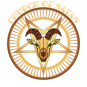
As part of the redesign of the Church of Satan website I chose to create an entirely different style from the one it has now. Church of Satan is a non-theistic religion that was founded on April 30, 1966, by Anton Szandor LaVey. This is important information to why I chose to move way from the mixed art style, which is a mix esoteric, 90’s Rock and oddly enough 20’s cartoons.
When I researched the religion, I learned a lot about Anton Szandor LaVey, some of his sources of inspiration, and the time period of the religion. When the religion was founded in 1966, there was a particular art style that stood out: Art Deco. This art style was used in visual design and architecture and was very popular in the 1920s and 30s, and it began to re-emerge in the late 60s. The reason Art Deco caught my attention is due to an overlap between Ayn Rand’s philosophy of Objectivism and the religion of Satanism. Both Rand and LaVey shared some of the same sources of inspiration, and therefore, there are certain elements in their philosophies that resemble each other.
Many of these decorations consist of rectangles made with the rectangle tool. This very quickly caused, this resulted in a lot of segments.
2
With the help of the Shape Builder tool, I was able to combine them. This turned out to be necessary if you want a consistent gradient. However, I also encountered situations where I had several shapes in the same decoration that couldn’t be combined but still needed to follow the same horizontal gradient. By turning all elements that belong together into a compound path, you can apply a smooth gradient across your entire Illustrator design with a single click. However, it’s important to merge overlapping elements, as overlapping parts can end up cutting into each other.
For the font I chose “Allerta”. It is humanist font and sans-serif, which gives it a readable and engaging reading experience. The font was also designed specifically for use in signage, where readability is more important than anything else. One of the biggest reasons what how fitting it was for the Art Deco style and the whimsiness the religion has in its original banner still shows up a bit with the use of the font. For the colours there is not much to explain. I went with a monochrome palette that in a gradient gives an almost golden look. While the use of gold is common in religious jewellery it isn’t something they advertise. The up-front golden tones not only fit the Art Deco style, but also a big part of what the religion represents.